3 Ways To Make Readers Crave Your Food Brand Newsletters
They flood our email inboxes daily, but how many do we actually read? With more than 200 billion emails sent and received daily, standing out in an overflowing inbox is no easy feat.
Email newsletters are one of the easiest and most direct ways to market food brands to consumers, so everyone and their mother sends one, but all that tasty content often leads to information overload. To decide what to include in your newsletter, first decide on a primary goal—to attract, inspire, or convert new consumers—and then tackle your content, design, and execution strategy.

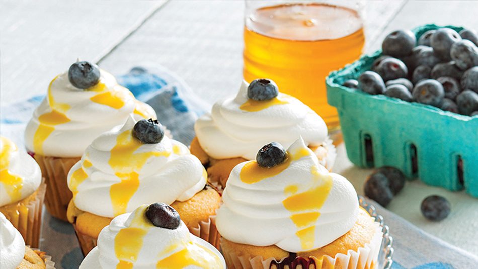
Images courtesy of EvansHardy+Young client, National Honey Board.
Key ingredients to help make sure your recipients eat up what you’re serving:
Know Your Audience
To deliver value—truly insightful content—in each and every email newsletter, you must be well familiar with your audience.
- Who is your target customer?
- What are their preferences, needs, and pain points?
- How can you provide them with content they want or value?
Chefs quickly differentiate a lean cut of meat from the fatty bits, so deliver real news and concise insights especially to their liking, not irrelevant or common information.
Create Attractive, Digestible Content
The most effective brands publish newsletters in a clear, minimalistic, and digestible format. For example, while simple in design, a ProChef Smartbrief campaign ranked in the top five food newsletters for their straight-to-the-point culinary news, demonstrating that quality content and authenticity matter most.
- Headline – Pique a reader’s interest with a crafty subject line and concise, yet descriptive teasers. Forbes suggests, “briefer is better.” A newsletter should take less than two minutes to read; a one- to two-line description with a “read more” should gain clicks.
- Photos – High-res images of beautifully plated food inspire new menu items. Aim to catch the eyes of chefs and busy restaurant personnel who only have a moment to scroll through emails. Visual cues on menus attract diners and, in turn, increase sales. The same holds true for emails.
- Formatting – Just as a menu featuring the day’s specials should be easy to read and not overwhelm, so should your newsletter. Arrange the layout so the reader can digest quickly and smoothly. Consider stacking content or sectioning it off in blocks.
- Hyperlinks – Use links to keep newsletter copy short while pointing your audience to more info. Think of your newsletter as an appetizer, allowing readers to click on links for more content to consume, if they have room or time for the main course.
- Practicality – Mobile optimization is key. In fact, GetResponse reports that 42% of mobile users will delete an email if it displays incorrectly. Pay attention to functionality and always test across browsers and devices before sending.
Measure and Iterate
A newsletter—or any email marketing campaign, for that matter—is only as good as the results it produces. By measuring how successfully your newsletters persuade consumers to check out your website or perhaps sign up for an event, you give yourself a base from which to improve. Track at least these six email marketing metrics: clickthrough rate, conversion rate, bounce rate, list growth, sharing, and overall ROI. Explore different ideas, measure the impact, and continue to test and tweak for progressive success.
Like a good meal, your newsletter should provide a lasting impression. Use it to get your audience to the table, create an appealing ambience, entice with a few small plates, and serve an unforgettable main course. Leave them anticipating their next meal.


